Case Study
BNIDirect
Login Redesign
The Challenge
BNIDirect is BNI’s corporate internet banking service, and its login page is the one screen every business customer has to pass through before doing anything at all. It carries a second job at the same time: it is where the bank tells customers how to keep an account safe.
The page as it stood served an Indonesian customer base in English by default, and reduced the bank’s security advice to a single orange block asking people to check the address bar — while promotional banners and a scrolling help panel competed for the same attention.
The Solution
A redesign that puts the language customers actually read first, and turns one warning into a standing security guide next to the form — what never to share, who to call when someone asks, and which networks to avoid.
Support moved onto the page as its own panel rather than a scrolling box, the password field gained a reveal toggle and a note advising against saving it in the browser, and a sticky running text line carries bank-wide notices along the foot of the page.
The Page as It Stood
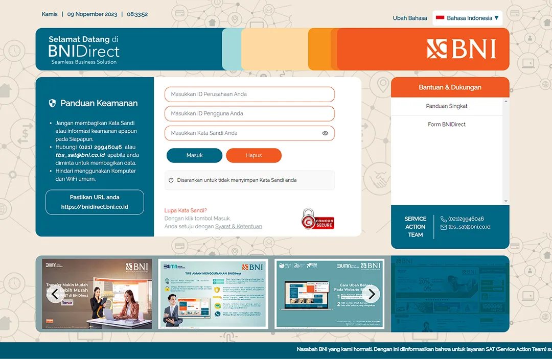
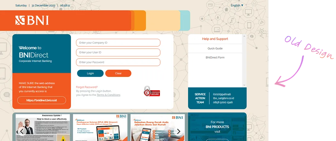
Three fields, two buttons, and a lot of things asking to be looked at. Worth noting what the old page already got right — the URL callout and the Comodo certificate seal were both deliberate anti-phishing signals, and both survived into the redesign in a clearer form.
- English by default. The language control sat in the top corner, set to English, on a service used by Indonesian businesses.
- Security advice in one orange block. The whole of the bank’s guidance came down to verifying the web address.
- Help behind a scrollbar. Quick Guide and the BNIDirect form sat in a short panel with its own scroll, next to the Service Action Team’s phone number and email.
- A promotional carousel below the fold. Awareness notices and product ads shared the space directly under the form.
Two Security Problems Worth Naming
Corporate banking credentials are worth stealing, and the two openings that mattered most on this screen had nothing to do with the bank’s own systems. Both are things a login page can speak to directly.
A look-alike address
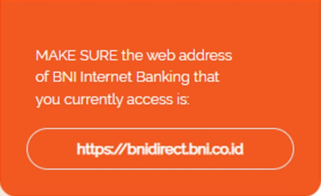
The existing page already asked customers to confirm the address they were on. It is the right instinct — a convincing copy of this page on a near-identical domain collects a working Company ID, User ID and password in one go — but as a block of orange text among other blocks of orange text, it read as decoration rather than an instruction.
The browser offering to remember
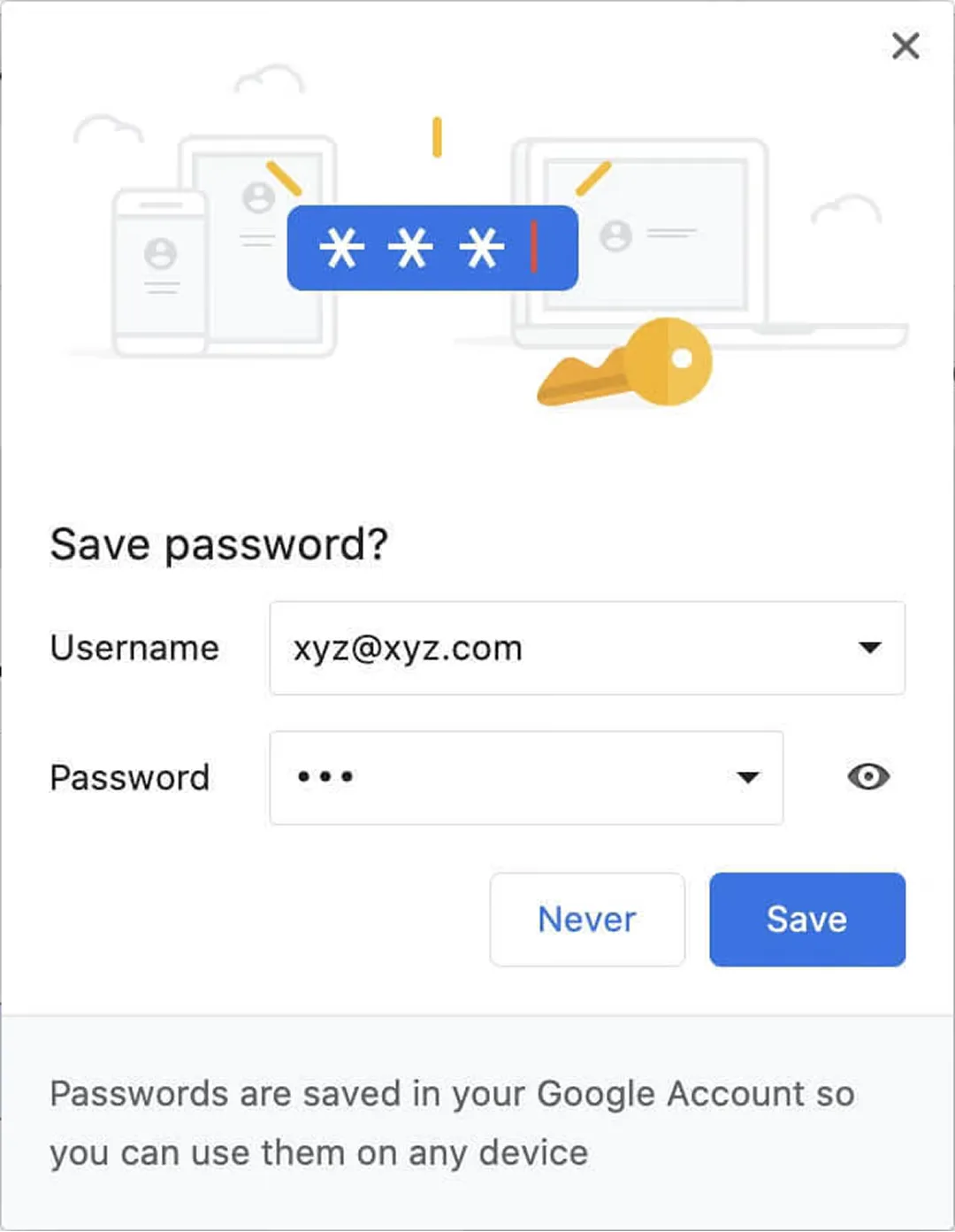
Every modern browser offers to save the password immediately after a successful login, and on a shared office machine that offer is the weak point: the next person to open the page inherits the credentials. The page had nothing to say about it, so the redesign says it right under the field — Disarankan untuk tidak menyimpan Kata Sandi anda, it is recommended you do not save your password.
The Redesign
Same three fields, same certificate seal, same Service Action Team contact details. What changed is which language greets you, how much the page is willing to say about staying safe, and whether help is something you scroll to find.
Improvements
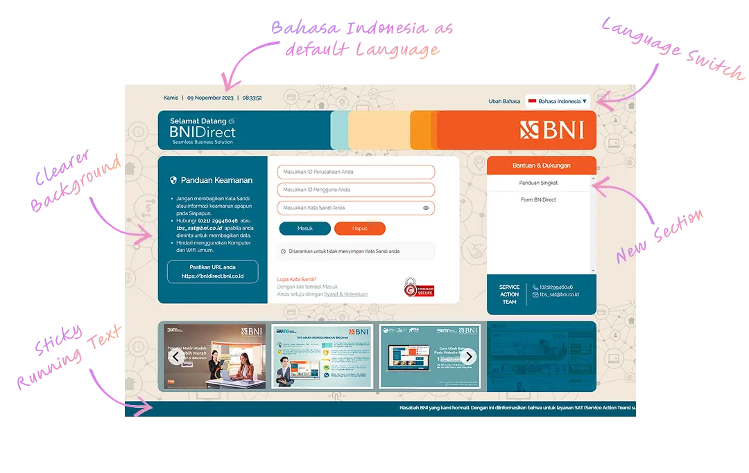
- Bahasa Indonesia as the default, with the language switch kept in reach
- A standing Panduan Keamanan security guide in place of the lone URL warning
- Help & support promoted to its own panel instead of a scrolling box
- A reveal toggle on the password field, and a note advising against saving it
- Sticky running text along the foot for bank-wide notices
- A calmer background, so the form is the brightest thing on the page
-
Before
After
What moved, and why
The annotated version below marks each decision against the screen it belongs to.